Unbeatable harmony
- Carton Converter: STI – Gustav Stabernack GmbH, Rainer Buchholz
- Brand Owner: Beam Deutschland GmbH
- Structural Designer: STI – Gustav Stabernack GmbH, Thomas Jonetzko
- Graphic Designer: PROOF – inhouse agency Beam Global
- Cartonboard Manufacturer: Tullis Russell
- European Carton Excellence Awards 2014
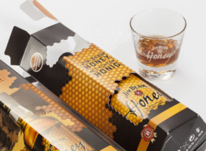
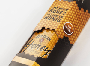
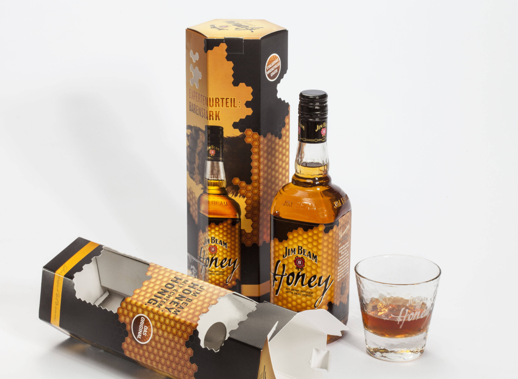
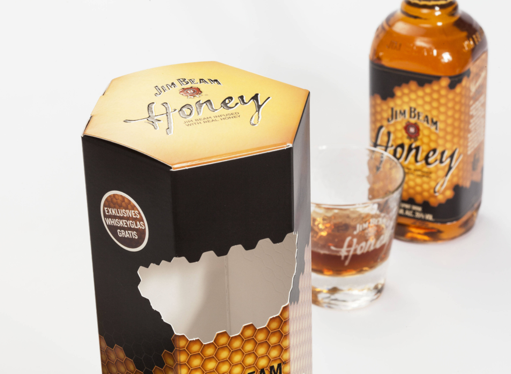
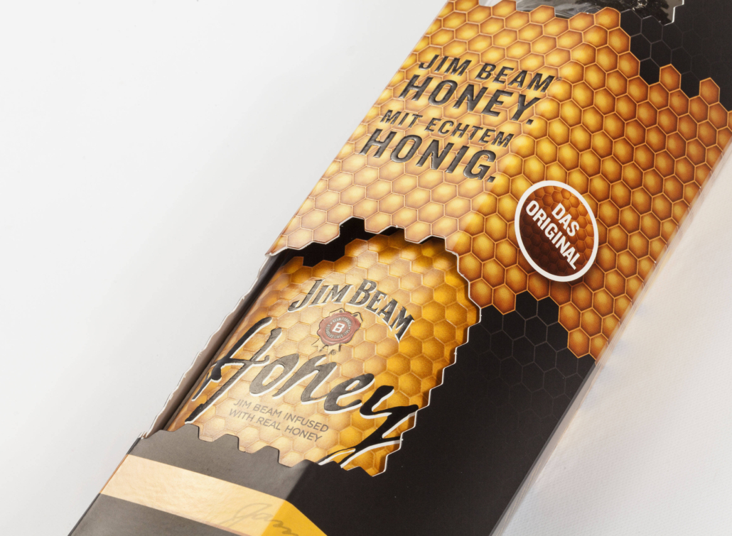
The characteristic shape of the honeycomb inspired the packaging design. Finishing with matt, UV spot varnish and effect varnish made the structure of the honeycomb visible and feel good for the consumer. In addition, the logo and honeycomb structure are embossed to deliver that certain tactile shopping feeling. The honeycomb structure also plays a part in the punching of the windows, allowing the exclusive product to be seen. The finishing not only attracts awareness and thus the probability of buying, it also underlines the premium character.







Jury Comments
This carton truly reflected its contents in that the emphasis in the design was on honey that the whiskey contained. The judges viewed this as a really good thought process in that the presence of honey in the whiskey was indicated in several ways on the carton. The image of honeycomb was printed and embossed and also cut out sections were made in the shape of a honeycomb. The bold colours of black and yellow also made the carton stand out and in a crowded market, especially at duty free outlets, the judges felt that carton would really stand out.