Form follows quality
- Carton Converter: Glanzmann Verpackungen AG
- Brand Owner: Choco Mundo GmbH
- Structural Designer: Urs Leuenberger/ Andreas Werner
- Graphic Designer: Christian Reichenbach
- Cartonboard Manufacturer: Iggesund Paperboard
- Pro Carton Young Designers Award
Many chocolate packaging look attractive, that is, prior to opening. There the premium look ends: crumpled cartons, torn aluminium foil and chocolate crumbs – and those messy stains. “Truly exquisite chocolate deserves really good packaging”, words by Andreas Werner, the Créateur at Jaclulu. He asked Glanzmann Verpackungen AG to create packaging like never before, made only of cartonboard and paper.
– it should be resealable and always look like new
– it should be handy and sturdy enough for handbags
– it should underline Jaclulu’s claim to be a premium chocolate in terms of haptics
– it should allow stylish presentation and easy handling
– it should enable “crumble-free” enjoyment
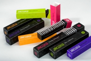
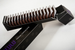
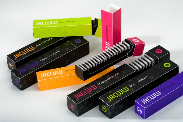
The Hopperbox met all the criteria – and more. A corrugated strip retains the wafers (buttons) in the box, keeps them apart from each other and protects them against mechanical damage. This follows a principle which Glanzmann Verpackungen AG developed for Swiss watch manufacturers for transporting their intricate dials. The corrugated strip also offers ecological benefits. The wafers need not be packed individually, thus resulting in considerably less waste than for comparable competitor products. In short: the hopperbox is like the chocolate it was made for – to the point, practical, pure and simply exquisite.dev_procarton_com






Jury Comments
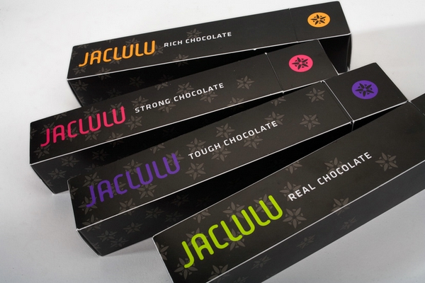
This was truly something that the Judges had never seen before. At first glance it looked simple but when opened it displayed the contents clearly and also had the added advantage of making the chocolates easy to get out without getting any crumbs or chocolate on your fingers. The opening system was intuitive and easy to use and the graphics that showed clearly the different types of chocolates contained in the different packs was clear, easy to read and attractive. The overall shape was also felt to be unusual in this market and as such would appeal to impulse purchasers.